
Offerings - App Description
ROLE
UX Researcher
Product Designer
TIMELINE
January 2026 - May 2026
TEAM
2 Visual Designers
1 Product Designer
SKILLS
Product Design
User Research
PROBLEM
College students have a hard time transitioning from receiving ready-made meals from dining halls to planning, shopping, and sharing their own groceries.
This case study following three participants gave me key insights into college students' problems surrounding food nutrition and storage:

IDEATION
Design Criteria and Opportunities
After conducting interviews and understanding our target demographic, the team divided the information gathered into clear and easy-to-digest graphics and sections.

Early Prototyping
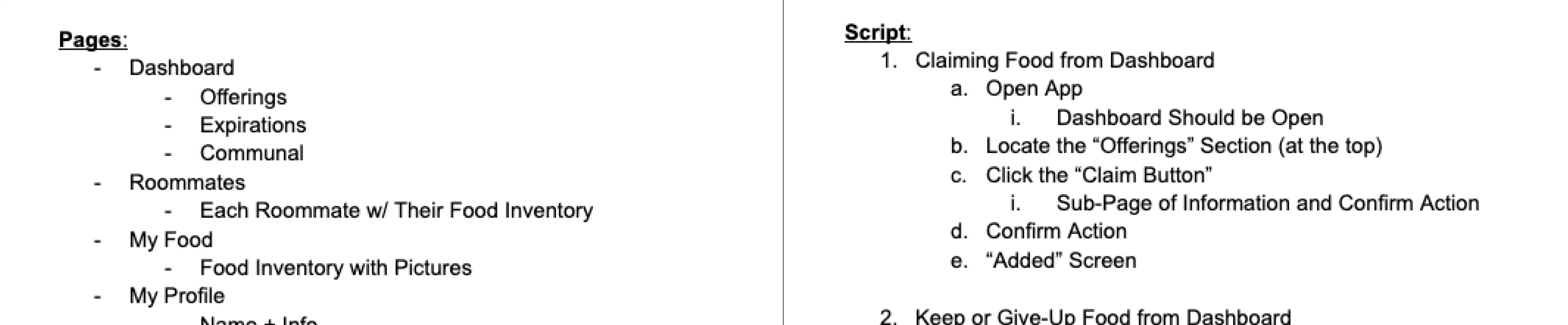
App Script of what the prototype would be able to perform.


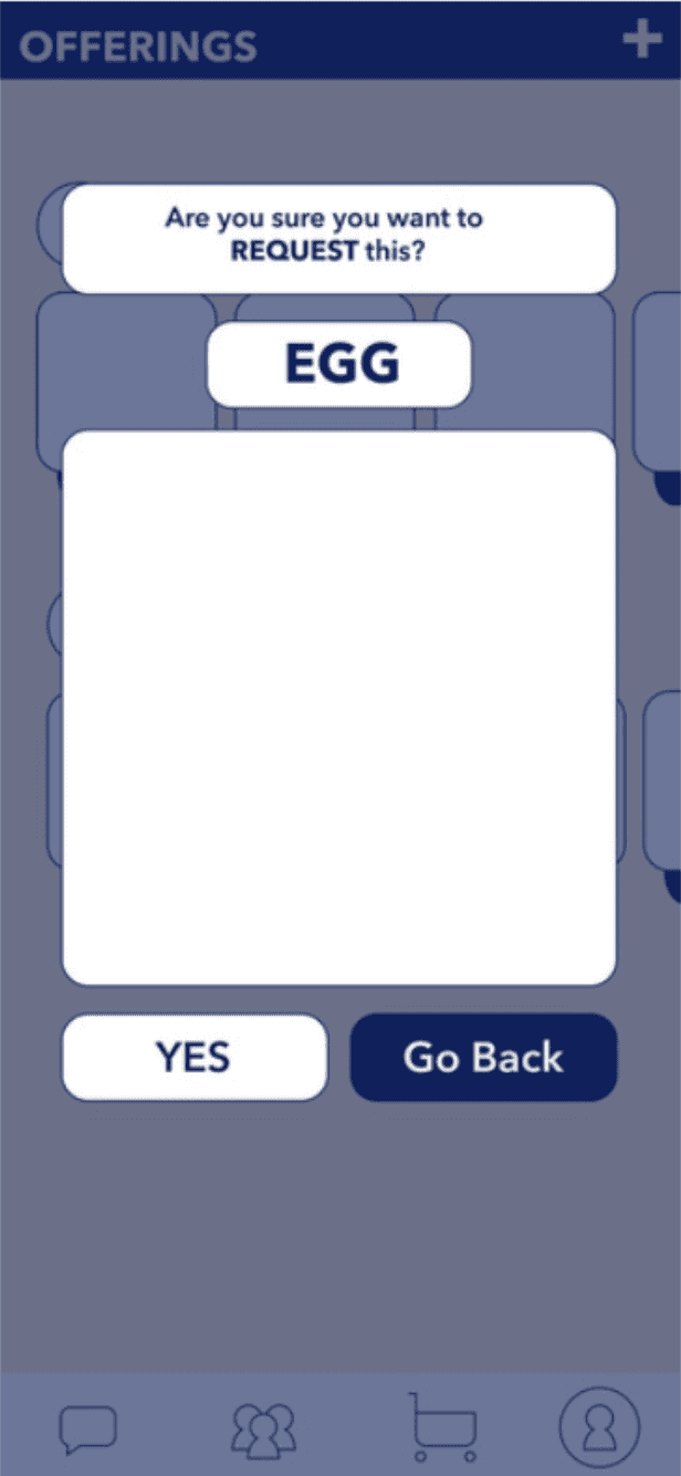


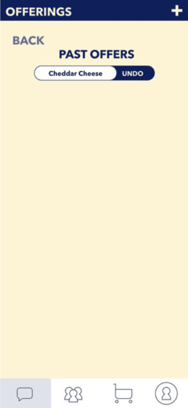


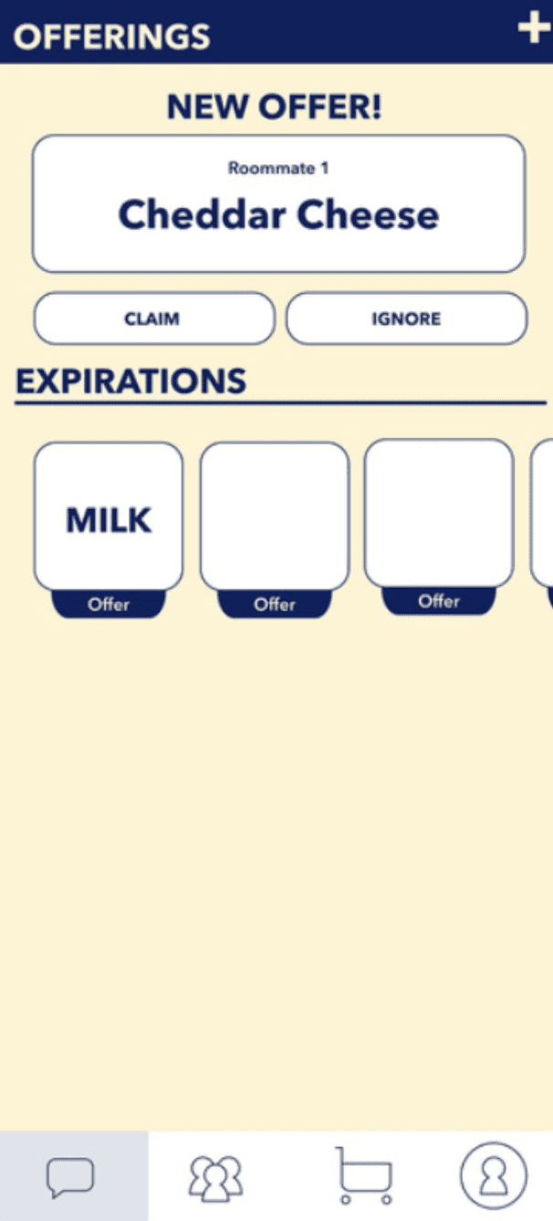

Medium fidelity iterations of our app, following our script.
After creating a medium fidelity prototype, our team felt as though it was best to make it a physical and tangible prototype that users could feel. Once the first phase of user testing completed, we then created our digital prototype.
CREATING THE FINAL PRODUCT
Navigating Design Choices
While working in a group, our team had differing ideas on what design choices would follow from the early prototype to the final product. In the end, the team had trusted me in deciding these design choices, which gave me full creativity in the interactions and features the app would have.
Changes At A Glance

Multiple changes were completed between the initial draft to the final prototype which can be reflected within the dashboard:
Text Margins
Section Spacing
Section Interactions
Icon Changes
Text Margins

The marginal space in the earlier prototype was too tightly spaced, making the app feel cramped and uneven. Using Figma's Auto-Layout, I adjusted the margins for each section, creating a consistent and satisfying experience for the user.
2. Section Spacing

In addition to the marginal spacing being inconsistent, the spacing of each section in the earlier prototype was also too tight, giving it that same cramped feeling. In the final product, I made each section even, allowing for the user to digest the information more comfortably. Each section and item is evenly spaced which will allow the user to proceed with what their needs are, rather than the hierarchy and sizing of the sections.
Section Interactions

Rather than continuing the current interactions that the team had wanted, I made both the Offerings and Expirations section horizontally sliding carousels that gave information to the user in a concise and digestible way.
4. Icon Changes

The idea of these iconography changes were to keep the action associated with it to be as intuitive and easy-to-use as possible. The overall consensus was that the previous "Upload" and "Download" icons were not sufficient in relaying to the user that they could "Keep" or "Offer" their Expiring Food. To combat that, I re-used the asset that I had previously done with the Offerings section to, first, maintain consistency, but also add in that intuitiveness that users want from an app.
In addition to the Expirations section changing icons, I also changed the dashboard bar icons to keep the same principles I had mentioned before.
FINAL PRODUCT
Dashboard
Roommates
Inventory
Main Highlights:
The Language of Color: signifies to the user if it's an action that's suggested for them to perform, if it's allowing the user the choice, or if the option is not available
Hierarchy of visuals to show what's the most important aspect in the sequence.
LESSONS LEARNED
